Clé d’Sol
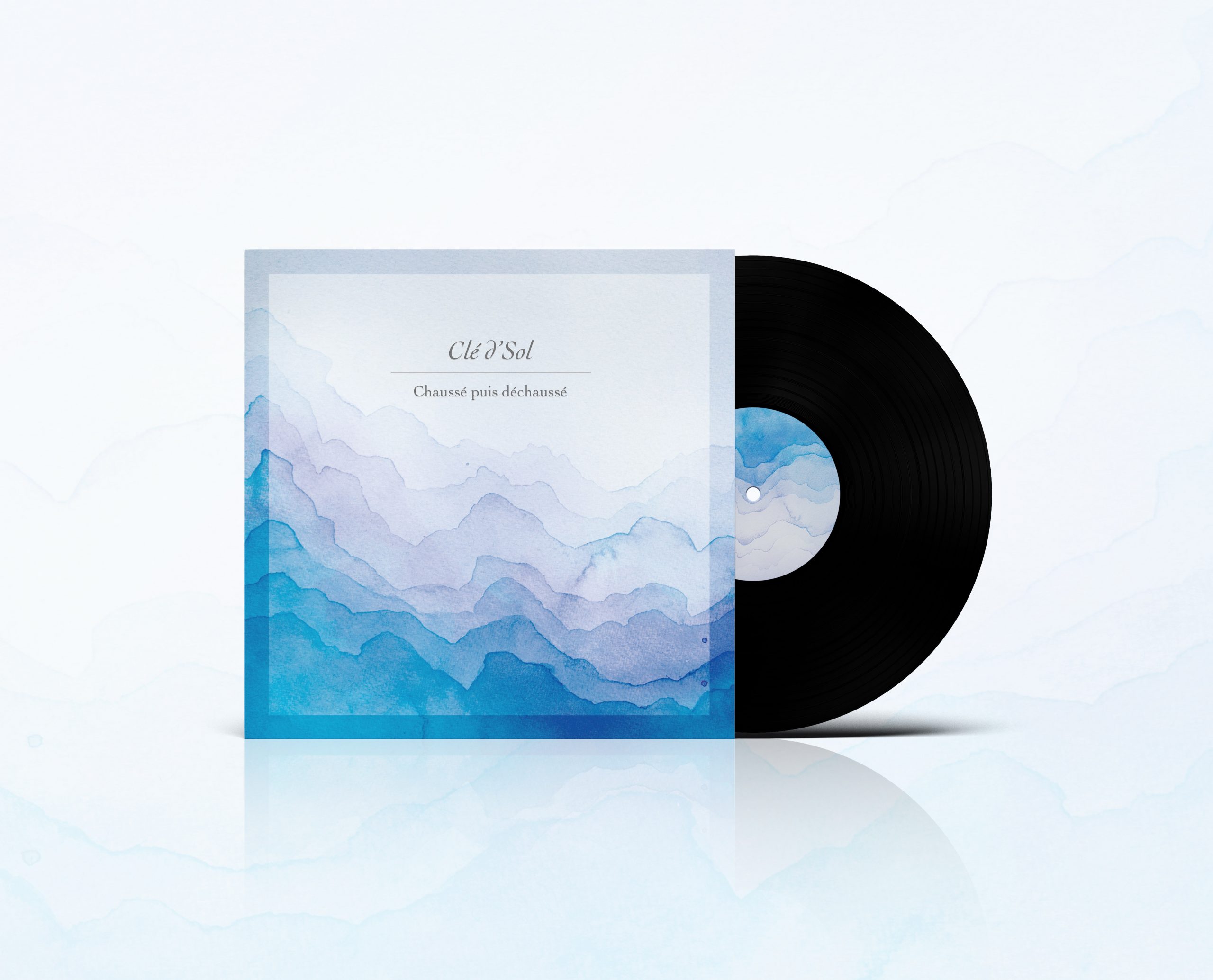
El grupo de música Clé d’Sol contó conmigo para el diseño de portada y contraportada para su nuevo EP, «Chaussé pues déchaussé».
Para este proyecto, los dos artistas respondieron a un cuestionario sobre preguntas bastante abstractas que me permitían a mí acercarme a sus gustos y a la imagen que ellos mismos tenían del proyecto.
Esto me sirvió para la elección de colores, de tipografías y de composición. No obstante debo agradecerle a ellos que me dieron toda la libertad para representar su música con un concepto que yo imaginé de ella.
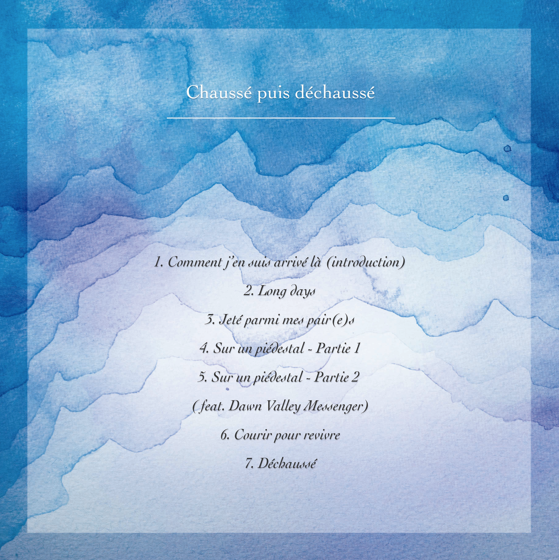
Su música es un viaje, y éste lo represento a través de diferentes estratos de acuarela, desde el color más claro al más intenso. El viaje del protagonista es así uno hacia su interior, donde las capas superficiales son más livianas y con forme se adentra a sí mismo las capas cada vez son más hondas y oscuras de atravesar. Hacemos ese guiño a un viaje al interior de la tierra a través de las capas.
La acuarela fue hecha a mano en un papel de alto gramaje. Posteriormente se escaneó y se editó en Photoshop. La fuente elegida («Cochin») , es elegante a la vez que sencilla, muy a la medida de la música de estos artistas. Fue todo un placer sumergirme en su universo.
···
The music group Clé d’Sol asked me to design the front and back covers for their new EP, «Chaussé pues déchaussé».
For this project, the two artists answered a questionnaire with rather abstract questions that allowed me to get closer to their tastes and their own image of the project.
This helped me to choose colours, typographies and composition. However, I must thank them for giving me all the freedom to represent their music with a concept that I imagined of it.
His music is a journey, and I represent it through different layers of watercolour, from the lightest to the most intense colour. The protagonist’s journey is thus an inward one, where the surface layers are lighter and as he goes deeper and deeper into himself the layers become deeper and darker to go through. We make this nod to a journey into the earth through the layers.
The watercolour was handmade on heavyweight paper. It was then scanned and edited in Photoshop. The chosen font («Cochin») is elegant yet simple, very much in keeping with the music of these artists. It was a pleasure to immerse myself in their universe.